Poster 3: Seppuku
- Samuel Reedy

- Apr 9, 2020
- 2 min read

The first step to poster 3 was planning out the world, characters and other supporting elements. I chose to keep it basic and stick with a 1 vs 1 samurai fight. To visualise the story and pacing I drew a simple graph with pace vs time. With the peak being the death of one of the samurai. Initially, I opted to use 3/4 frames to set the scene, 5/6 frames for the fight, and 3/4 frames for the mourning and ending.

This was my initial storyboarding, with 3 frames for the setup, 6 for the fight, and 3 for the ending. However, I felt this storyboard did not properly reflect the haiku and did not show an honourable death. So I decided to change the death of the samurai to be seppuku, a more unique twist, which plays better into the theme of honour.


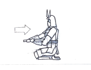

I designed two characters, making their styles unique. Then proceeded to create sketches to import into photoshop.

This was the final result. I used black in the background to draw focus and signify the main parts of the storyboard (the initial clash and completion of the seppuku). I used shadows to create a sense of direction and contrast between the characters. Dynamic poses were used in the fight to demonstrate speed. The storyboard is read from left to right in rows rather than top to bottom in columns as I believed this was a more natural way to read a storyboard. The absence of background in most frames is to keep the concentration on the characters, almost as if it is a camera with a shallow depth of field and the background is blurred.


Comments